~ INTRODUCTION ~
Corey Nelson was searching for a dashboard application that could meet his needs as Manager of I.T. at ECSO. After much research, he discovered Grafana, and was so delighted with the product that he wanted to share his experience with other techies; he presented a Tech Talk on Grafana on Thursday, August 20, 2020 at Luna Cafe in Ashland.
~ REAL TIME DATA DISPLAYS ~
He explained that his daily activities with 911 Dispatch for Jackson County provided incentive for displaying detailed visual data—in real time—about the resources managed by ECSO; from staff status to equipment status and metrics to first responder service call metrics.
~ EXAMPLE GRAPHS ~
Corey began his presentation by displaying some example graphs and then moved on to the installation process for Grafana—on both Windows and Linux. He wrapped-up by building some graphs and demonstrated how easy it is to customize the displays.
~ IT’S ABOUT TIME ~
Keep in mind that Grafana is an open-source analytics program designed to display data in various ways. The point of the exercise is: Time. You can take a snapshot of your system data and share it. And you can save the that data at different points in time. Or, you can share it to a Cloud or to a public entity.
Q: In what form is the data saved?
Corey: It’s a proprietary Grafana format—a dashboard form; basically, a JSON file. You simply upload the JSON file to wherever you want. You must have Grafana to view the file in the correct format.
~ FEATURES ~
Grafana will support a variety of open-source engines, and there are different kinds of graph plug-ins that can be employed to display data in various ways.
Some of the features include:
- Dynamic Dashboards:you can look at metrics, explore data, view and display logs.
- Alerting:Once your data reaches a certain threshold (pre-set, by you), it will actually alert you via email, SMS, or via any other notification you set up.
- Multiple Data Sources:You can have multiple data sources feed a singlegraphic display.
- Annotations:If you see a spike in your data, you can annotate that spike and provide ancillary information regarding an explanation for the spike.
- Ad Hoc Filters.
- Themes (built-in).
Q: So, this is really a smart program and the display part of it isn’t dependent on another product; [IOW] more than fundamentals are included.
Corey: Yes, the whole back-end is there, the display is there… I’m going to show you all of that.
C: This is complex.
Corey: It seems complex.
C: Robust.
Corey: Yes.
~ INSTALLATION ~
Continuing with his demonstration, Corey installed Grafana on both Linux and Windows Virtual Machines. He used two different tools during the demonstration: InfluxDB and Telegraf.
~ INFLUXDB ~
Influx is a database that’s designed to store timed data; any kind of data that’s associated with a time stamp. InfluxDB is mostly used for CPU Usage, Energy Input/Output, Power Usage, Disk Space; anything you want to capture with a time stamp. You can then go back and display the data at the selected point in time, whether that’s five minutes ago or a year ago, and you can do averages. The database is an open-source database designed to quickly retrieve the stored data.
~ TELEGRAF ~
Telegraf is a system that’s designed to capture metrics through all kinds of sensors: IoT, Windows, communications with cloud-based services, and the software can talk to databases…What Telegraf does is: capture the data and feeds it into Influx.
~ DEMO PLATFORMS ~
Corey explained that he was running Windows with Server 2019, with SQL Server Express. Obviously, Windows Server is not free, but everything else is. He brought some sample data from his production environment to demonstrate.
In preparation for his demo, he downloaded both Grafana and Telegraf binaries. His platform is CentOS Linux 8, which is basically a RedHat clone. He did the server install only, with no GUI. He had to install one additional tool with it: URW Fonts; Grafana required it when he went to install it and he didn’t want to to take time to download it during his presentation. [From Wikipedia: “Of particular importance are the established relationships with Chinese and Japanese companies, for which URF developed a special software for editing the Kanji characters.”] Then he downloaded Grafana, InfluxDB and Telegraf—from their respective websites, and they were are all currently-stored on the local VM.
Corey demonstrated the windows server that he built. He then went through an install of Grafana on his Windows Server.
~ GRAFANA FIREWALL ~
The next thing he did was: because his Windows Server has a firewall on it, you have to open the port to that firewall. This runs on port 3000. So he built a new rule and opened port 3000, called it Grafana, and then he was able to connect with his Grafana interface. He was actually using his local machine and talking to the server. By default, he was talking on port 3000. He demonstrated the process of logging-in to Grafana using Admin | Admin.
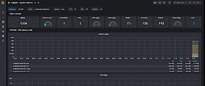
Since there was no data loaded at the time, the first thing Corey did was to point out some tools displayed on the left side of the screen. When he hovered his mouse over the option, a tooltip popped up to describe the action for that option.
Before he went into the details, he demonstrated some data.
First, he added a data source from one of the many supported data sources. For this example, he loaded a test database. Once it was properly set up, the indicator turned green.
~ DASHBOARDS ~
By default, Grafana automatically presents a streaming sample dashboard; simulated for this demonstration. If you had real-time data coming in, that data would be displayed.
Corey explained that this was not howheuses a dashboard; he uses Grafana outside of the scope of the way the product was designed to work. In fact, Corey fearlessly ventured into new territory and created a way to use Grafana to suit his needs for Dispatch.
~ ALERTS ~
With this dashboard, you could build alerts. For example, let’s say the display showed the amount of energy being used by a product or how much money was being made/lost in the stock market. Once the value exceeded the threshold, you would receive an alert.
Corey then demonstrated, on his (SQL) server, some of his production data from a few weeks ago to show you how he used it in Dispatch.
~ GRAFANA FEATURES ~
While it was loading, he went over some of the features of Grafana.
The Dashboard Name is at the top of the display; that takes you back to the Home Screen. You can search for various things…mostly dashboards. You can create new dashboards, or folders to organize your dashboards. The whole dashboard section allows you to go in and manage all your dashboards, so you could have hundreds of dashboards showing all kinds of information. You can also set up playlists and display your dashboards by name; e.g., Dashboard1, Dashboard2, Dashboard3. You can display them on a kiosk and cycle through them. For example, if you wanted to show ten different workstations, you could build one dashboard per workstation and have it scroll through the whole set of workstation displays.
Snapshots allow you to take point in time pictures of the data on your dashboard and save that information for later.
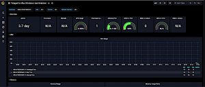
After SQL is loaded, the sample data can be viewed.
~ REAL-TIME DATA DISPLAY ~
Corey showed a table that he builds to view Top 200. This particular table is built every ten seconds in Dispatch; the reason he does it this way is: he’s gathering data from multiple data sources and some of them are unique—e.g., CSV data, web API data—and he runs a series of processes that gather up all this data and write the data to this table. Then he can display that data via Grafana.
Corey then showed the group what the data looks like in Grafana. First, add the local SQL Server. The display shows that it supports MySQL, PostgreSQL, and Microsoft SQL Server.
He then named the dashboard MyDatabase and entered the IP Address of the server, which was displayed at the top of the display; it uses the client to connect to the database. At that point, he had two databases.
Corey explained that Grafana has an extensive collection of downloadable dashboards.
Operating with two dashboards, Corey imported third dashboard; a JSON file previously downloaded, in preparation for his presentation. Corey copied/pasted his JSON file, gave it a unique identifier, clicked on Import, and, voila! The dashboard was displayed.
~ MONITORING DISPATCHER STATIONS ~
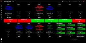
Corey then explained that the dashboard he was displaying was an example of what they use at ECSO every day in Dispatch. This dashboard is designed to show various pieces of data very rapidly. He turned on some components to show the data in red so he could talk about what that might mean. The Dispatcher Status shows each dispatcher’s phone position status: Red, Green or Blue.
Status Meanings:
Green: They are on a telephone call.
Blue: They are available for calls.
Red: They are not available for calls.
The data in Position 16 (middle of bottom data row) shows that dispatcher is OUT which means they are making an outbound call. If a dispatcher was taking an inbound call, the display would show “911.” The other thing this display shows is how long they have been in that status; that gives the supervisor a good idea of when the dispatcher will next be available: did they just change the status, have they not changed the status, are they not available but should be available. Since they use a round-robin queue for taking calls, this provides an indicator of staffing needs.
In some cases, like we see at CAD13, CAD14 and CAD15, those positions are typically call-takers and they are supposed to be available for calls all the time. In this case, the dispatcher at position 15 has not been available for 28 minutes. That means that, if the dispatcher is supposed to be a call-taker, they are in the wrong status and we have to find out why.
C: So you’re spying on them.
Corey: We watch the workload of the center. The idea is: you can quickly get an idea of what’s going on with the whole center; staffing loads, 911 call queues, and monitoring whether everyone who is supposed to be watching is actually watching.
~ APPROPRIATELY-ALLOCATING RESOURCES ~
Under their name, there’s another field: their Role, which displays how they are logged-into the system. Are they a Fire Dispatcher? A Law Dispatcher?
Beneath that Role, there is an area called the D Area, which identifies their Dispatch Area. This identifies the part of the county they are responsible to send calls to. For example the dispatcher at CAD01 has two D Areas, which means the dispatcher is going to be busier than a dispatcher with only one D Area. And, what can happen is: someone gets up for a break and someone else has to take over their area temporarily. So the manager can determine that they need to add someone to a D Area to cover for the person on break. And all I’m doing is a database query when I want to see this data.
Across the middle is a list of call queues. The first four call queues show calls in the queue. The next row displays how long the calls have been in the queue. This demo display does not reflect reality; we would never have three calls in the 911 Call Queue and a zero 911 call time.
~ CONFIGURING ALERT LIMITS ~
Corey cruised to the database and made a couple of changes to reflect data that was more common. Note the (configurable) Refresh Rate in the upper left corner of the display; currently set to 20 seconds.
So we have all that data but what’s interesting is: in the bottom righthand corner there is a collection of status displays for various system resources. Corey can use these displays to determine whether or not they are operational.
~ MERCY CONNECTION EXAMPLE ~
Mercy Connection: Whether or not Mercy Flights has a VPN up and running. This is where he uses a third-party tool to query. He’s pinging things on the outside, he’s looking at SNMP Queries for some of his hardware, he’s looking at my database online, and then he has a product that monitors a couple of devices and if the application gets turned off for any reason, the displays will turn red. All he does is check these displays and, if they are not working correctly, he writes a zero to the database and within a few seconds, it shows that area is down.
This is not what Grafana was designed to do, but that’s how Corey is using it. And it could be used for all kinds of different things just like this.
~ Q&A ~
Corey has additional data that he’s not displaying so he can demonstrate how to add panels (the little boxes in the display.)
Click on the Add Panel Button to display a new panel. You can set the size. Then click the Add Button to actually add the panel. And this is the time that you design the format of the panel; how you want the panel to look.
The first goal is get the correct data. Corey built an SQL Query. Using a pre-defined query instruction, Corey can find how quickly an agent picks up a 911 call; what’s the average pickup time?
The next task is to build the select statement. Because this is not time series data, we’re simply building a table. It is not a graph. It is a gauge.
Now, we can build a gauge that tells whether or not the agent is picking up calls within our standards.
Corey continued with the setup process. His goal was to see the minimum and maximum of the circular meter on display. He defined a minimum of zero and a maximum of 6,000 milliseconds. The display was then in milliseconds, which doesn’t help many people, but you can select from a variety of measurements.
Next set up color thresholds. Let’s say anything from zero to 3,500 milliseconds is displayed in yellow and anything above 5,000 is red.
After this process, you can add the panel to the display and view the results. You can also duplicate the freshly-created panel and create one for each dispatcher by changing only the position to point to the proper dispatcher.
Corey then repeated the install, setup and usage processes on a Linux system; essentially, the same as on a Windows system, with obvious system-specific differences.
Remember: This product is free!
C: That’s an amazing tool!
Corey: It’s really useful. Once you get into it, it’s not that difficult to create dashboards that are really nice—and useful. Our small, tech-savvy group was captivated by the possibilities of this product.
Corey’s overview provided enough information about the product to entice people to begin thinking about how they would apply Grafana’s resources in their own environment.
Corey is an excellent speaker. He has the ability to present his material n a clear manner so it’s easily-understood by all levels of techies. Thanks, Corey!
We hope you will join us for our next Tech Talk, probably after the first of the year.
Author: Karen
Written: 8/30/20 – 11/8/20
Published: 11/8/20
Copyright © 2020, FPP, LLC. All rights reserved.